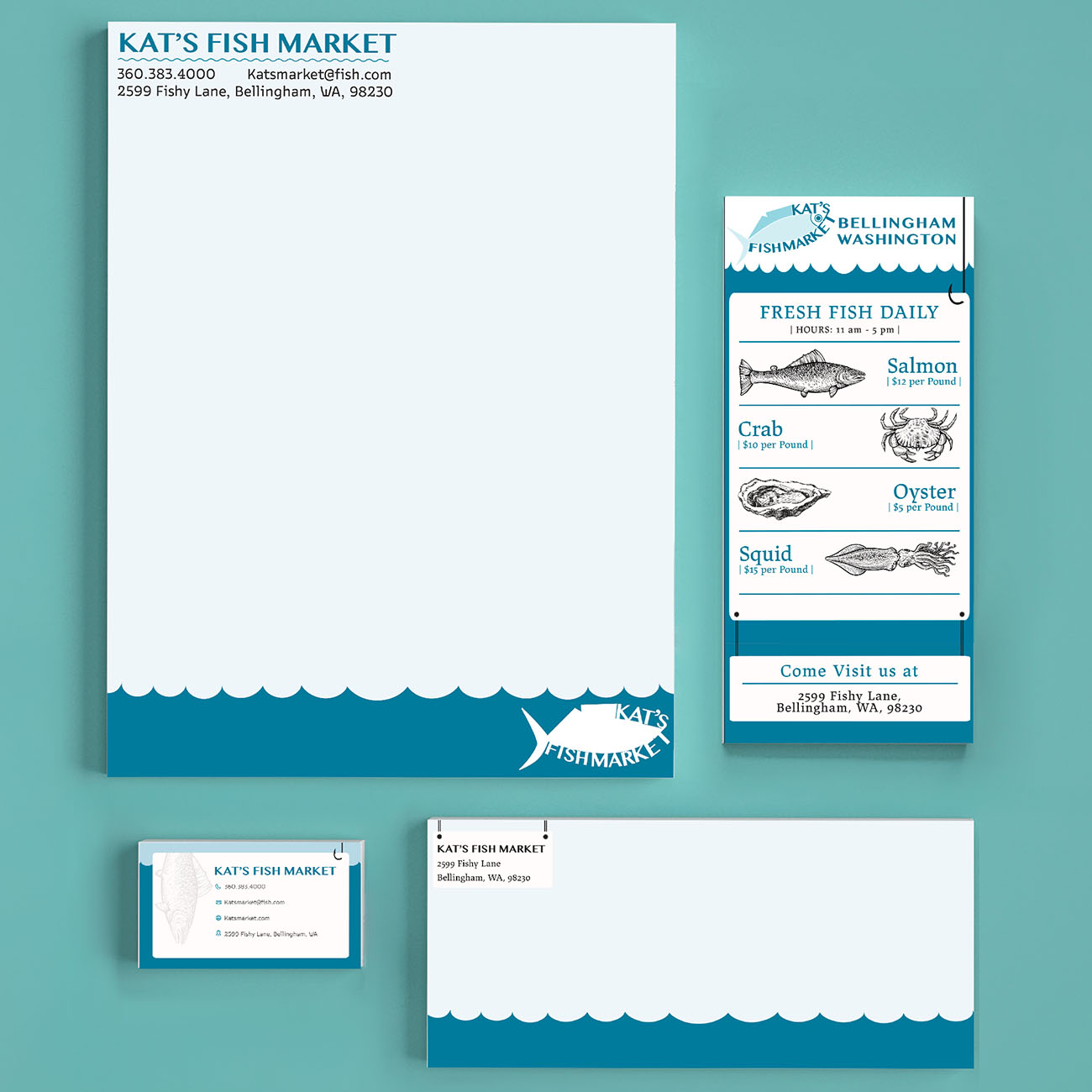
I kept coming back to light blue and vintage fish illustrations because they felt like a natural fit for a local fish market. I kept the illustrations simple so they could work across different pieces of stationery without becoming too busy. The result was a branding system that felt a little nostalgic while still being clean and cohesive.