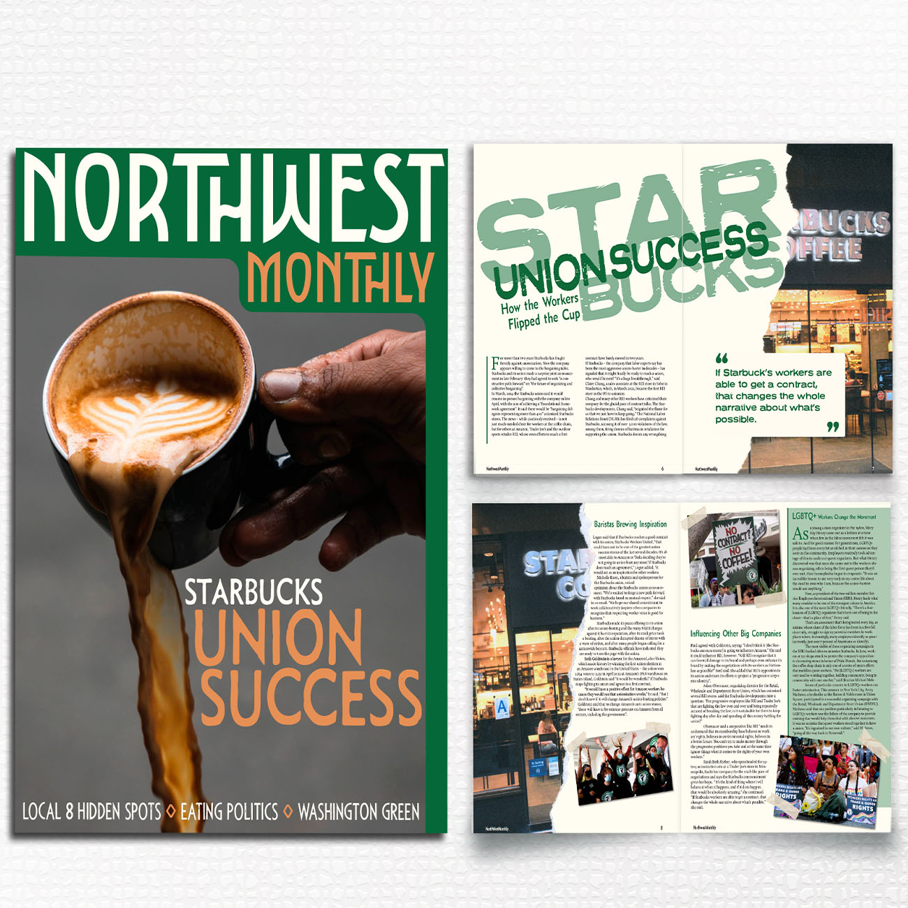
Green felt like an obvious choice for both the Pacific Northwest and Starbucks, so I decided to make it the main color. For the image, I chose a photo of coffee being poured to hint at some of the tension and disagreements surrounding Starbucks. I also played around with earthy colors, fun typography, and I ended up ripping paper to give the feature layout more texuture as well as the “ruff” topic of the Starbucks Unions